Announcement

Collapse
No announcement yet.

Skin colour accuracy?

Collapse
X
 
  • Filter
  • Time
  • Show
Clear All
new posts

    Skin colour accuracy?

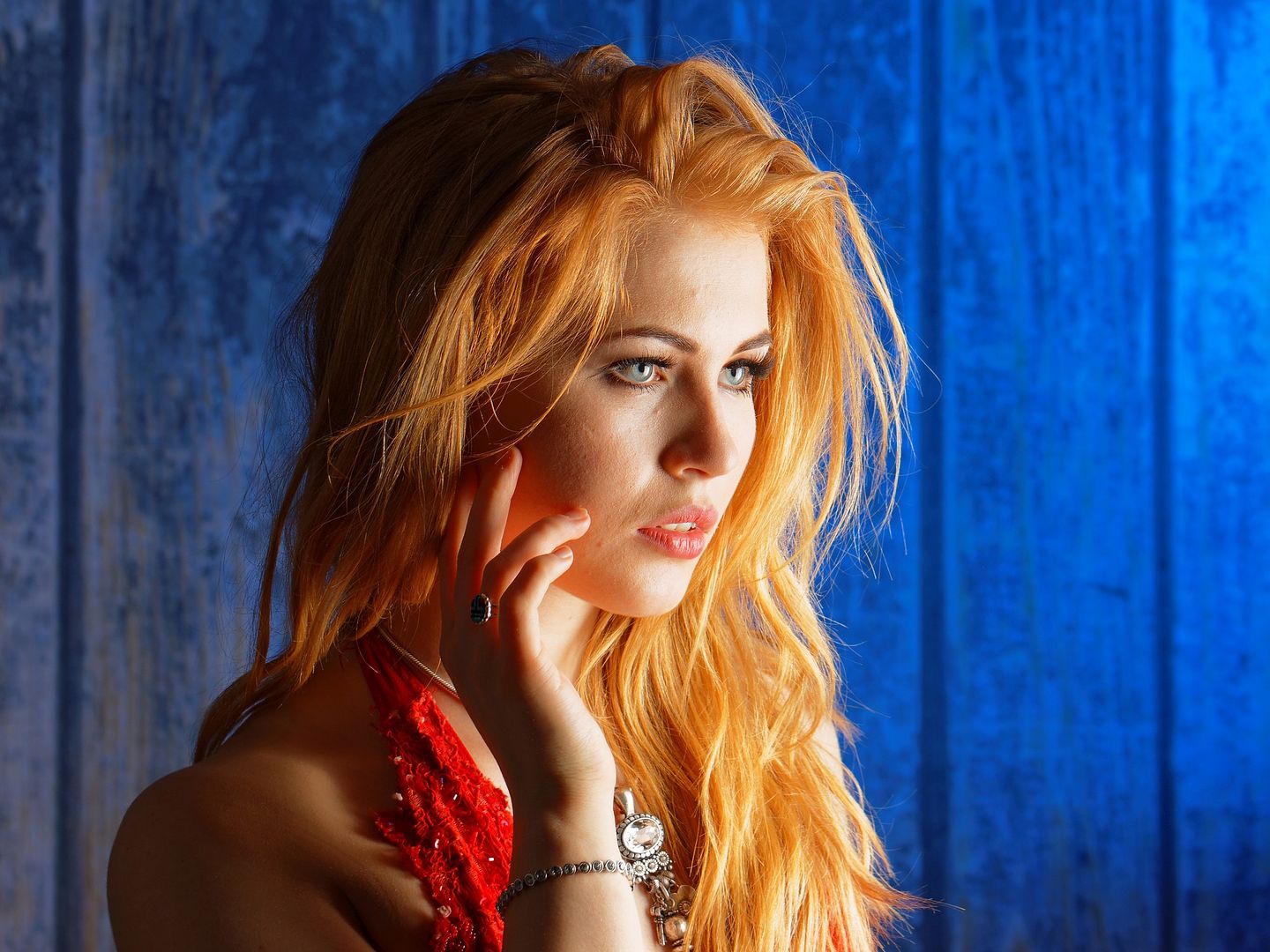
    I took my own approach to colour and light here and I'm most interested in comments on the colour, followed by the light. (I played with the lighting ratio in processing as there weren't enough lights handy to get what I wanted, gotta love modern cameras where you can just fix these things later. It's had no local edits.)

    Her hair isn't quite that rich a colour in reality, it had a little help, not a lot, but some (just globally). Her face and lips are also also paler in "real life" and benefited (I hope, I'm asking) through the same change to try to get the look I wanted. The background also had a bit more grey in it originally. (I like to think this could have been achieved with tweaking the lighting, but that would have been a big diversion from getting shots I could tweak later.)

    In some ways I'm asking about the way a lot of people work very hard to get skin tones perfectly accurate. I went for the skin tones (especially the lips) and hair colour the way I wanted them, which are different to reality by a modest amount. I did wonder if it was just me and people would hate it...

    Last edited by DrJon; 28-01-2016, 12:53.

    #2
    Re: Skin colour accuracy?

    Using "warm up" filters on portraits was pretty normal in the days of film, most people seem to prefer a warmer look to skin. I remember when Fuji brought out their Reala film, which was intended to be more accurate in colour rendition, it wasn't very popular because people thought it looked too cold. I don't have any problems with the skin tone here. However, there are things I think could improve this as a portrait. First of all, there is so little light on the back of the hair that there's an almost straight line between the brightly lit front and the dark back which I find off putting, perhaps a reflector would have been useful to cast more light on the back. The other thing is the background, with straight vertical lines not very nice. If you don't have a plain background (this looks like curtains) I'd move the model further away, maybe use a larger aperture, and try to get the background completely out of focus.
    The main lighting is fine, she's an attractive model and the picture generally complements her, but I think a few changes could improve it.
    I've been reading a lot about various aspects of photography, including portraiture, recently and so when a picture is put up here I look and think what the expert authors of those books would say. Its partly a way of testing myself, what have I learned from the books, so please don't take any comments of mine as being overly critical.
    EOS 6D, 6D Mk II, 80D, 70D, 100D, 200D, M50, M100. Canon 10-18, 18 - 55, 55 - 250 IS STM lenses, Canon 16 - 35 mm F4L, 35 mm EF-S macro, 50 mm F1.8 STM, 60 mm EF-S macro, MPE-65 macro, 85 mm F1.8, 200 mm F2.8 L II, M 15 - 45 mm, M 22mm F2, M 32mm F1.4. Sigma 24 - 35 F2 Art, 135 mm F1.8 Art, 17 - 50 F2.8 DC, 105 mm OS macro, 100 - 400 C, 150 - 600 C.

    Comment


      #3
      Re: Skin colour accuracy?

      The background is (fake) wood panels lit with a blue gelled flash. I thought the light-dark transition curved nicely with her hair? Criticism is most welcome, well if it's constructive anyway ;-)

      Here's some more detail:

      5Dsr, 100mm f2.8L, 1/200, f5.6, ISO 100
      Speedlite with blue gel onto background (1/8 power IIRC), Speedlite into tall and narrow softbox on right (1/4 power I think), imaginary lighting-ratio-fixing Speedlite added in post, sort-of. Gotta love the price on those imaginary Speedlites :-)
      BTW it should have really been f6.3 for optimal JPEGs, but f5.6 didn't clip in Raw so it's cool. That's technically called being brave, or ETTR if you're being generous. (I didn't think it would clip, but wasn't sure until later.)

      The reasons I cropped it this way are:
      The crop is as tall as it is as I like her hair cascading down in the light, plus the jewellery fits in nicely. The width to the right is to give her some space to look in to and to give a decent area of the blue colour I like. The space to her left is because I didn't like it when I cropped into her shoulder (which I'd already done on a couple of other shots from the shoot anyway), so left it with the shoulder and enough space not to crowd her, I also liked having the wood join there as a sort of frame too, plus I wanted a dark area to stress the light she's looking into. The overall crop also makes her head not look large in her surroundings, hopefully showing her in a situation rather than just her. (50MP is so handy, shoot once use three times, pick from: head, head+shoulders, top half, full length.) It's actually quite a big crop on the original.
      Last edited by DrJon; 28-01-2016, 15:57.

      Comment


        #4
        Re: Skin colour accuracy?

        I think that's a cracking picture, love the colours, I wouldn't worry about them being different to real life.p, I would think 99% of all photos ever produced will have been tweaked one way or the other from the original. As long as the skin tones look right the rest will fall into place :)
        Canon 1DX, 50D, EF500 F4.0 L, EF100-400 f/4.5-5.6L I , EF100-400 f/4.5-5.6L II, EF70-200 f/2.8L II, EF180 f3.5L Macro, EF 24-105 f/4L, EF17-40 f/4L, EF2.0X III, EF1.4X III, 430EX II, MR-14EX...

        Comment


          #5
          Re: Skin colour accuracy?

          She is a great model, and I like the photograph. A couple of "thoughts":
          - I think the bright blue on the RHS is too bright and is distracting.
          - I like Richard's comment above about a hair light of some sort to give definition to her hair at the back.
          - As a personal preference I sometimes pull back a little on the saturation if I think I have gone too far with the colours. It might be worth exploring that.
          - I wonder if I was processing this if I would try and reduce highlights more, and reduce the shadows (i.e. lighten them) a bit.
          - I understand your reasons for the crop, but wonder if I wouldn't lose a bit on the left and add more to the right (subject to softening that bright blue a bit)

          Please take in the spirit offered! I am no expert...

          Best

          Richard
          Richard Anderson Photography at www.raphoto.me

          Comment

          Working...
          X